Back to QMetry All Products Help Page
Test Run Summary Gadget
The reports are added as Dashboard Gadgets to let users -
- view multiple gadgets at a time, whereas the reports can be viewed only one at a time.
- easily compare and analyze data of multiple projects.
Add Gadget on Dashboard
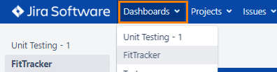
1. Log into QMetry for Jira, go to Dashboard and open a dashboard.
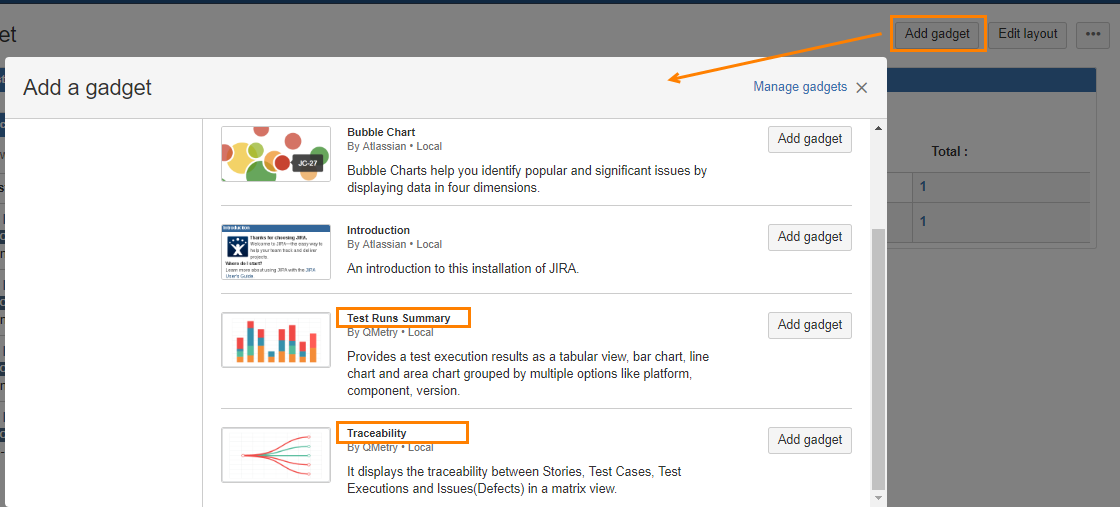
2. Click on the Add Gadget button.
3. Select either of the following gadgets to add on the dashboard by clicking on the corresponding Add gadget button.
- Test Runs Summary
- Traceability
Generate Graphs using Gadget
Let us see how Test Run Summary gadget is added to the dashboard.
Test Run Summary Gadget
The report provides a test execution results as a tabular view, bar chart, line chart and area chart grouped by multiple options like platform, component, version.
Go to Dashboard and click on the Add Gadget button.
Select Test Run Summary to add as a gadget on your dashboard.
The Test Run Summary gadget looks like below. You can configure different graphs using different criteria.
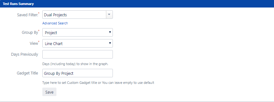
Select values for the following fields:
- Saved Filters: See how filters are saved in the section below.
- Group By: Type in the search box and matching Group names will populate. Two new options are added to the list: Project and Executed On. See the Group By section below.
- View: See the Types of View section below.
- Days Previously: This new filter is added to consider data of last particular days. By default it is 30 days, which you can change as required.
- Gadget Title: Enter Title to gadget. This is optional one.
Filters
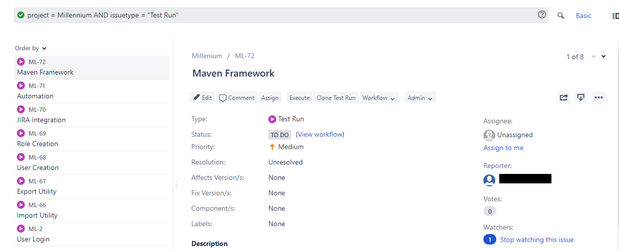
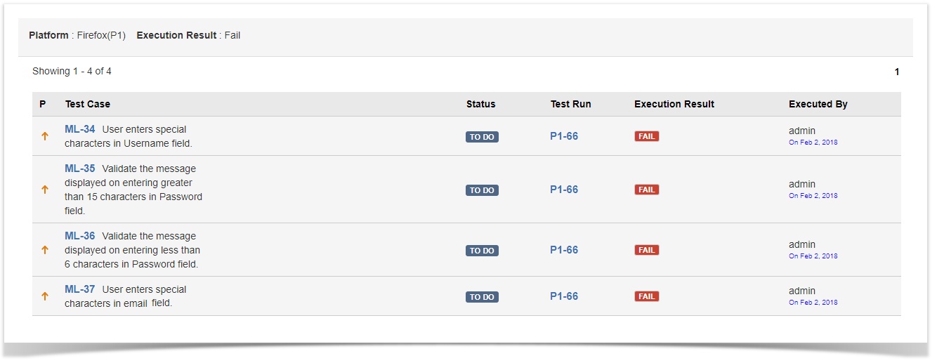
- Saved Filters: The drop-down displays saved Jira filters containing Test Run issues. The following image displays an example of a Filter that contains assets corresponding to the applied JQL.
Group By
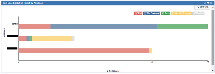
- Assignee: Assignee of the test case associated with test run selected under Filter.
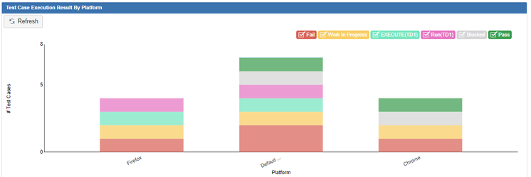
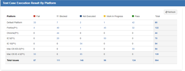
- Platform: Platform of the selected test run under Filter.
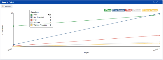
- Project: Report is generated grouped by "Project".
- Executed Date: If you are grouping by Executed On, then the Period field appears on the screen. Select from Daily, Weekly, Monthly and Yearly options as required.
- Test Run: This is an issue in Jira with Issue Type "Test Run".
- Story: It is a Story or any other Jira issue linked with test run.
- Test Scenario: It refers test scenarios associated with test runs selected under Filter.
- Component: Component of test case associated with test run.
- Sprint: It refers to Sprint in which the test runs are allocated.
- Label: It refers to Label assigned to test runs.
- Version: It refers to Version of test runs under Filter.
Days Previously
This new filter is added to generate report considering data of last particular days. By default it is 30 days, which you can change as required.
For Example,
You enter 15 days here, then the reports will be generated on the basis of data of last 15 days.
Types of Views
Test Run Summary gadget provides the following views. Each view has its own pattern to represent the data which helps you compare results between different groups or track changes over a period.
| Horizontal Bar Chart | |
This horizontal bar chart facilitates comparison among components within a group e.g. Assignee, Platforms, etc. The y-axis represents the Groups, while the x-axis represents values for the Groups.
| |
| Vertical Bar Chart | |
The vertical bar chart will switch the axes of the horizontal bar chart to display the data. The x-axis represents the Groups, while the y-axis represents values for those Groups.
| |
| Tabular View | |
The counts in table are clickable, which help you drill down the data. Clicking on the count opens the test run page in a separate tab. Note: Only Tabular View is available for reports which are grouped by Test Run, Story or Test Scenario.
| |
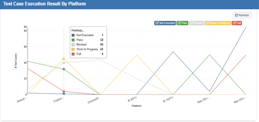
| Line Chart | |
This chart displays test run information as a series of test run data points that are connected by straight line sections.
| |
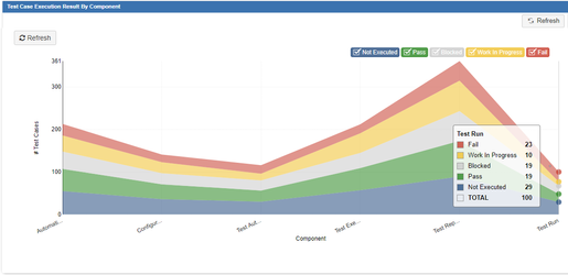
| Area Chart | |
The Area chart is based on the Line chart. Each color in the graph displays distinct area for test run status.
|
- Refresh icon: If you want to accommodate the changes done in the data and generate a new graph synced with it, then click on the Refresh icon provided on the graph screen.
- Legends for Graph: Graphs contain legends of only those components which are visible in the data of graph. The legends are selectable on click and vice-a-versa. The components will be displayed in accordance with the legends selected.
Hover over the graph components to read the corresponding details and counts.
Back to QMetry All Products Help Page