How to Create and Edit Custom Report? (4) (4)
The Visual Analysis provides you with an advanced & easy-to-use interface to quickly create your own Customized reports for category bases analysis. This generates "best-fit" charts for the report data automatically.
Why visual analysis?
QMetry already has predefined system default reports which generate the data reports with the charts & these reports are based on the business processes of organizations who usually follows. The important role of Visual Analysis comes in picture when bigger enterprise-level organizations in a need to generate the reports with graphical orientation on the basis of their real-time data with their own complex report requirements. This feature gives the strength to the users to customize the reports to bring fruitful values to their organization.
The best part of this feature is, this is accessible for all the folks who are the users of QMetry. Individual users can create their own customized graphical reports & can add them in their gallery. These reports can be shared among the users you want. The report generation can be a one-time activity & can use unless this gets re-customized.
Custom reports can even be scheduled to run and be delivered to your email inbox giving you reporting, how and when you want it. Follow the instructions below to create a custom report:
How to create a custom report?
- Go to the Advanced Reports > Visual Analysis Report
- Report generation is based on the categories. The initial step is to select the category of the data on which report has to be generated for the user. So, defining the report requirement & its falling creating is mandatory.
- Select the Category/ Entity
- Execution : To create reports based on the Test Case executions which enlists the bugs encountered during the test execution phase along with execution status
- Issue : To create reports from the data of the QMetry internal issues for projects not integrated with Jira.
- Issue-Jira : To create reports related to the Jira Issues, for projects integrated with Jira
- Requirement : To create reports from the data of requirements present in QMetry that have not been imported from Jira.
- Requirement-Jira : To create reports related to the Jira requirements, for projects integrated with Jira
- Test Case : To create reports related to Test Cases based on Project created in QMetry.
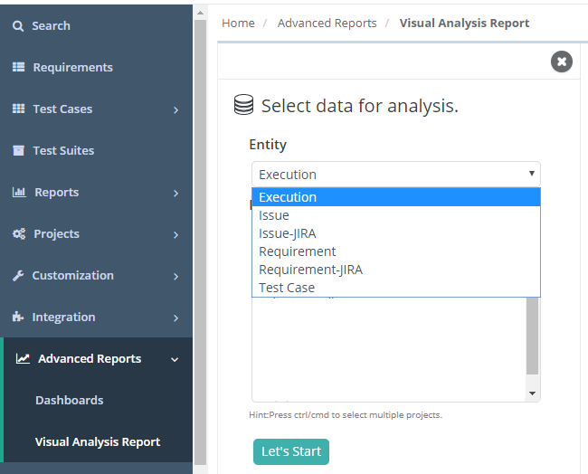
- Select Project
- Click on - 'Let's Start'
Let's take an example of creating Custom Report for Entity- Execution, Once the entity is selected - QMetry will ask you to select a Project for which report is going to be generated.
In this example, we'll create a Custom Report which will show us - 'A Summarize View of executions done for a Release & Cycle' for the selected project. - After the Visuals loads, select the Bars chart from the visualizations menu on the left of the page, as shown below:

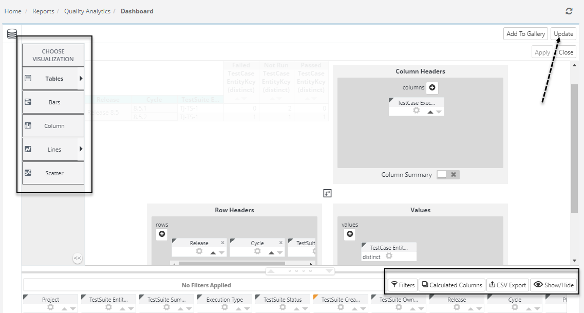
- Considering, Visualization selected as: 'Crosstab Table'. Once selected,
Three blue "drop zones" will appear, as shown below, which identifies the data columns used to create the visualization along with Column Headers, Row Headers, and Values.
- Assuming that Column would be - Execution Status, Hence Click the Execution Status column "pill", drag it to the 'Column Headers' zone, and drop it there.
Drag & drop the Release, Cycle and TestSuite Entity column(s) "pill" to 'Row Headers' zone.
Similarly, drag & drop the Test Case Entity column "pill" to the 'Values' section.
So this particular structure will show us the Execution Status on Columns, Rows would be grouped by Release, Cycle, and TestSuite-Entity with the details of the TestCase-Entity Key.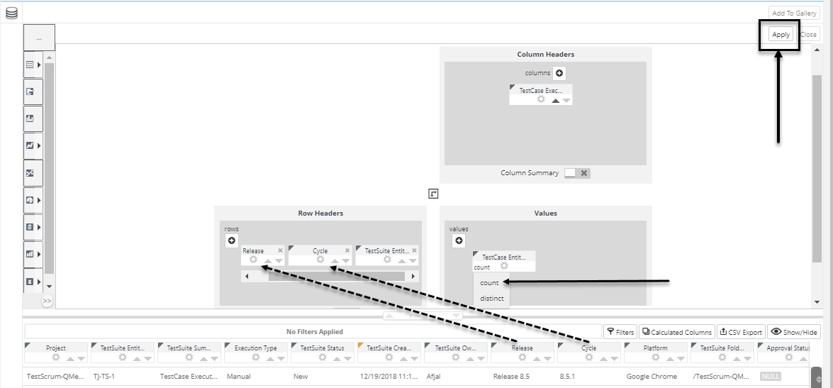
- Once the structure is ready, click on the 'Apply' button to generate the Report.
See the below output of the generated report.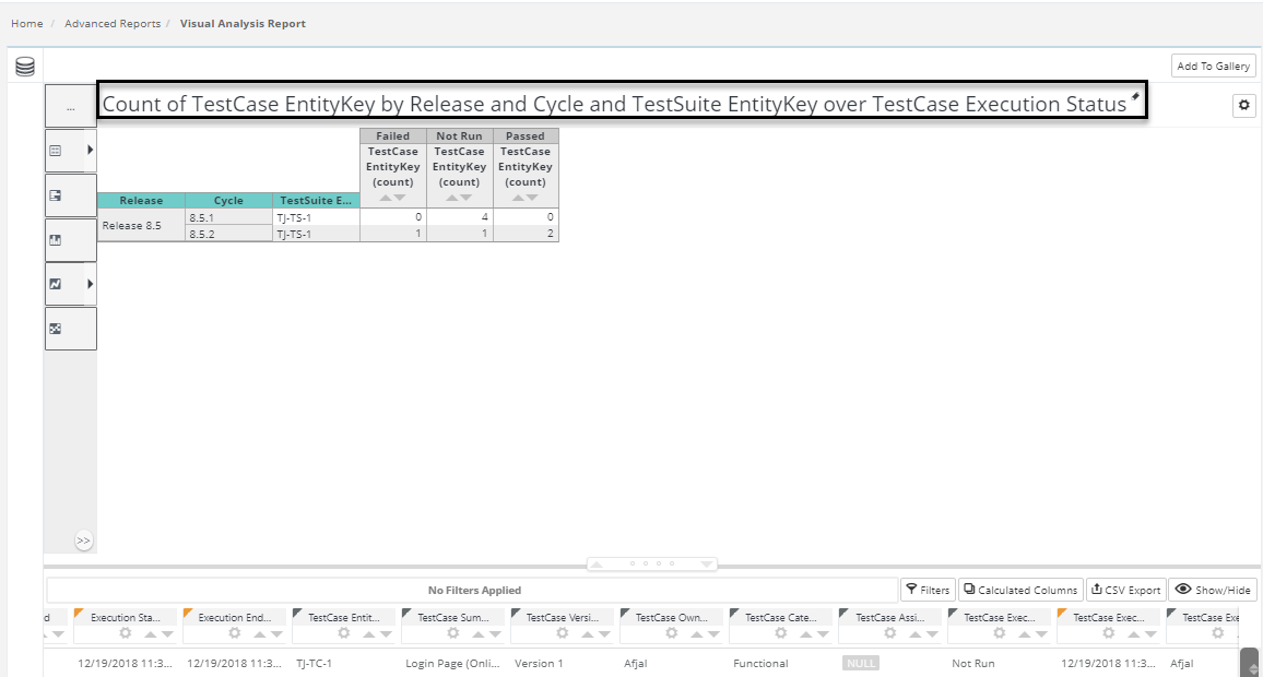
Change the Visualization in order to convert your report to Bar/Line/Area/Column (based on Percentage/Stacked/Grouped) etc.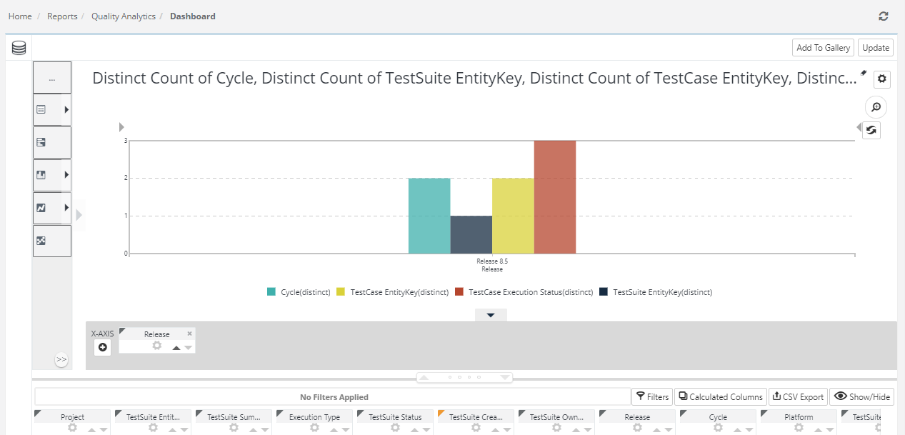
Note : Once a report is created, It will show the data of specific project only, for which we have created the report.
In QMetry v8.5, advanced report shows the Custom Fields at the end of the list, see the below image

How to add your custom report to Dashboards & Galleries?
The Visual Analysis includes an optional feature that lets you create a visualization in the thinkspace and then add it as a new panel in an existing Logi Dashboard in another report, or add it to a Visual Gallery.
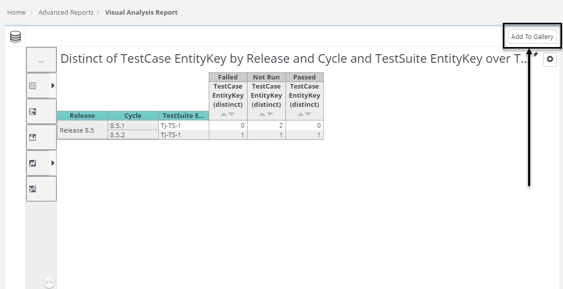
It will say to : "Add to Gallery" >> Add panel.
The chart added to the gallery will be displayed on the Add Gadget pop-up when you add new dashboard (by clicking on the '+' button under Advanced Reports > Dashboards).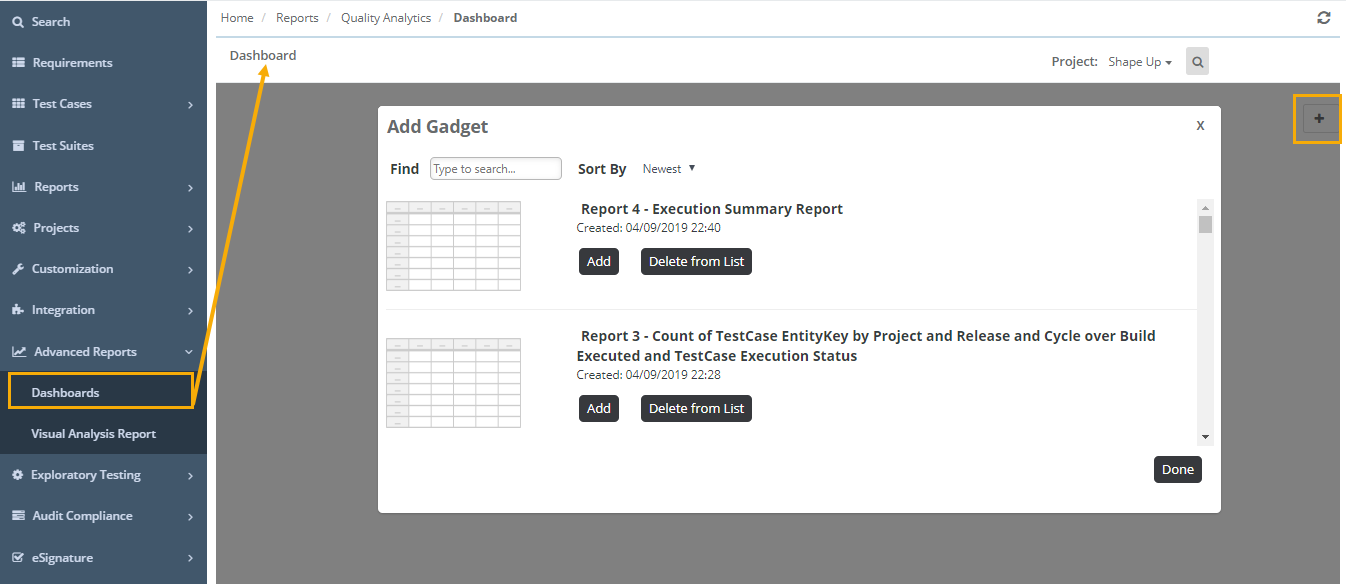
When configured for use with a Dashboard and the button is clicked, the visualization is added immediately as a new panel in the Dashboard, as shown above. Just before the visualization is saved, you'll be prompted for the Panel Title (with the chart title from the Thinkspace provided as a suggestion) and an optional description for display.
The new visualization thereafter appears in the Dashboard Configuration Page or the Visual Gallery, as shown above, just like any other resource, complete with a thumbnail image. The visualization can be removed from the visible dashboard panels and from the configuration page or gallery entirely, using the usual controls.
You can insert multiple charts into a Dashboard using this technique. For more information about Dashboards.
How to edit an existing custom report?
As reports are customizable in QMetry Test Management, you can make changes to the reports as often as you like. You can also delete reports when you no longer require them.
Here’s how you do it,
- Go to the Advanced Reports > Dashboards tab and go to your dashboard (i.e. Here we have named our dashboard as 'My Dashboard')
- Select the report you’d like to edit or delete from the list of reports displayed.

- Click on 'Gear' icon, select - Edit Visualization
(Note: Click on 'Remove' to delete the Customized Report when no longer require)
- Once the report gets loaded, further click on the 'Gear' icon to edit an existing report. It provides the functionality to rename the report, change the visibility/visualization of the report, alter the filter conditions and/or charts. You can change everything. (Highlighted section(s) in below image are used to edit report further)
- Hit Update when you’re done.
Note : Saved custom reports can be edited anytime from the Dashboards / Edit Visualization - only by the user who created it. Sharing a report with other users only gives them read-only access, they can't edit.
How can user apply the filter on reports columns?
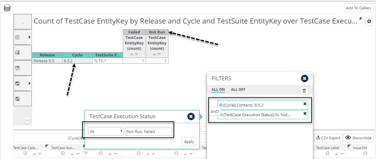
Considering the same example for the custom report which we have created above - 'A Summarize View of executions done for a Release & Cycle'
Here’s how you do it,
- Launch the report on - Edit Visualization mode
- Click on 'Filters' tab highlighted in below image
- Applying filters on Cycle, TestCase Execution Status
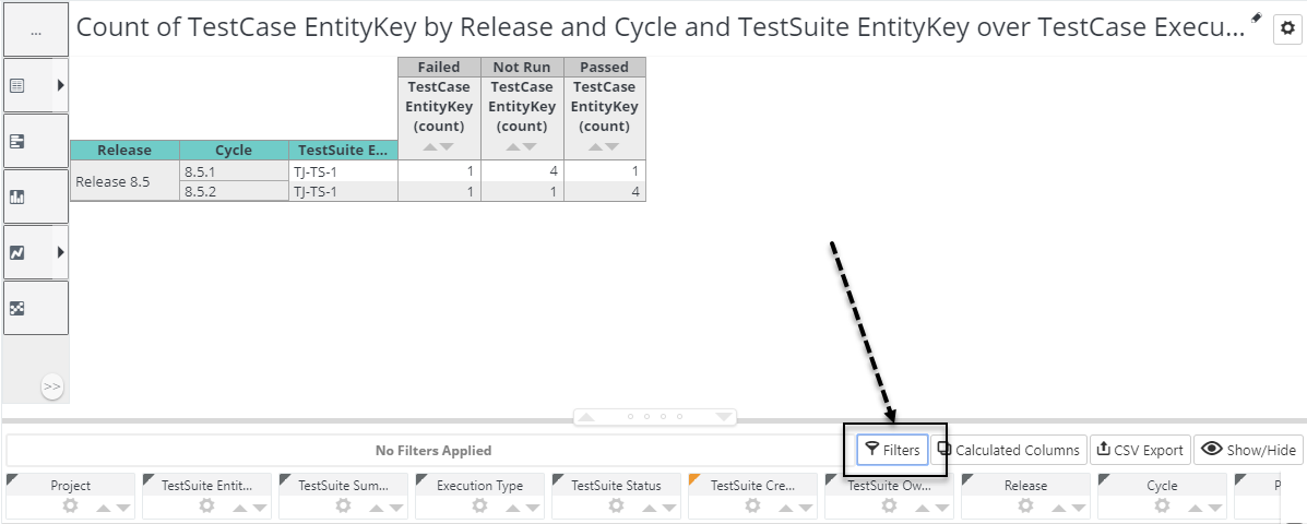
- Now applying the filter condition on Cycle & TestCase Execution Status column (i.e. Cycle = 8.5.2 & Test Case Execution Status = 'Not Run', 'Failed')
- Select Cycle column "pill", drag it to the 'FILTERS' zone, and drop it there. It will ask you to specify the condition, select 'Contains' or any appropriate option from the list & specify the value in the textbox. (i.e. Contains - 8.5.2 / if you want to specify more than one value need to pick 'IN' from the list)
- Select TestCase Execution Status column "pill", drag it to the 'FILTERS' zone, and drop it there. Similarly, specify the condition, select 'IN' or any appropriate option from the list & specify the value in the textbox. (i.e. IN - Not Run, Failed)
- You can also specify more than one filter by adding AND/OR condition

- See the below result, Report will be showing data for - Count of TestCases executed during Cycle 8.5.2 with TestCase Execution Status as 'Not Run & Failed'
- Once the filter is applied, reports give us the ability to Turn ON/OFF the filters as per the requirement. Click on 'ALL ON' or 'ALL OFF' in order to do so.
Click on the 'Delete' icon to remove all the filter(s) from the report.