How Visual Analysis Report Chart looks like? (4) (4)
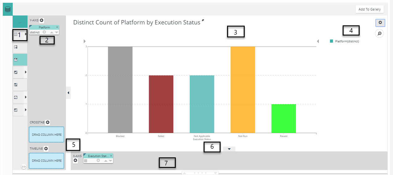

The user interface consists of two main areas, as shown above. The upper area displays the charts and tables you create and the lower area displays your data in a simple table. Here are some more details, keyed to the numbers in the image above:
- Visualization Menu - Click to select a visualization appropriate for your data and to easily switch between types.
- Pills - Column "pills" in X- and Y-axis "drop zones" identify the data columns used to create the visualization.
- Visualization - A Chart, Crosstab Table, or other visualization is displayed here when you select its data.
- Settings icons - Click to control the legend (may also have other purposes), delete the visualization, or choose selection modes.
- Extra Columns drop zones - Dropping column pills here to create a Crosstab Table or a Timeline Chart.
- Show/Hide arrows - Click to show/hide pill drop zones; allows you to see a larger view of the visualization.
- Table Resizer - Click arrows or drag dots to change the number of table rows shown.
- Data Enrichment - Click to open drop zone and controls for creating data filters, calculated columns, and do more. Once created, filters are listed in adjacent area.
- Column Pills - Pills appear at the top of each column of data in the table; they contain sorting, filtering, and other controls.
- Data Table - Data available for analysis appears in a table here. It's pre-selected by your application developer and may be restricted by security permissions assigned to you.
The Visual Analysis report feature is an investigative tool and, as such, the charts and calculations you create in it are for quick analysis of your data. Our QMetry application has been configured to do so, they can be saved and re-used in later sessions.