How to create Customized report using Visual Analysis? (4) (4)
Define Report
Report generation is based on the categories. The initial step is to select the category of the data on which report has to be generated for the user. So, defining the report requirement & its falling creating is mandatory.
- Go to Report Section
- Select option Quality Analytics
- Click on Visual Analysis
Category List
- Execution
- Issue
- requirement
- test case

Create your First Customized report
Let's make first visualization, a bar chart, so you can see how easy it is to do. In this, and the following examples, we'll use data from the QMetry Test case execution database but you can use any data (list provided) with similar data types to follow along.
In this example, we'll create a chart that shows the Count of Platforms which has the executions done with statuses as Passed, Failed, Blocker & Not Run.
Step 1. After the Visuals loads, select the Bars chart from the visualizations menu on the left of the page, as shown below:

Step 2. Two blue "drop zones" will appear, as shown above. In the data table, click the Platforms column "pill", drag it to the Label drop zone, and drop it there. We call the line that appears when you drag a pill the "Blue Dot Connector".
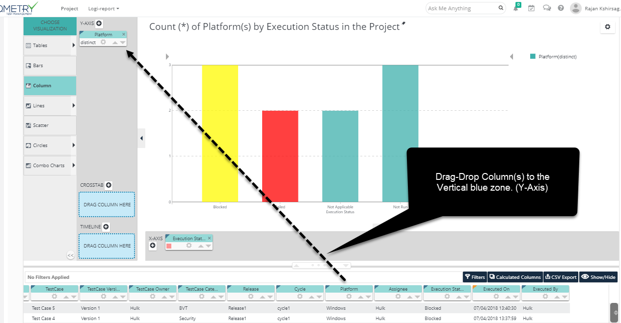
Step 3. Repeat the process by dragging the Test execution status column pill into the Data drop zone, as shown above.
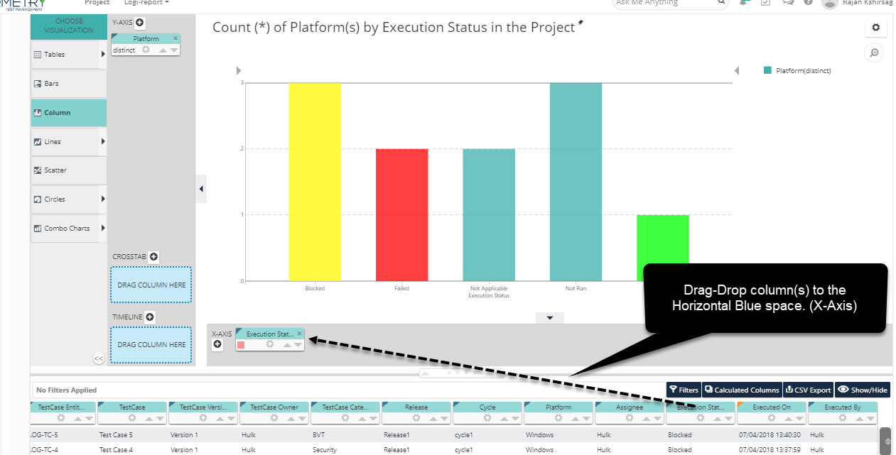
A chart will be instantly generated, as shown above. You've just learned the Visualization ANalysis most important technique: dragging and dropping pills. That was easy, wasn't it?
Additional Visual Analysis functioanlity Features
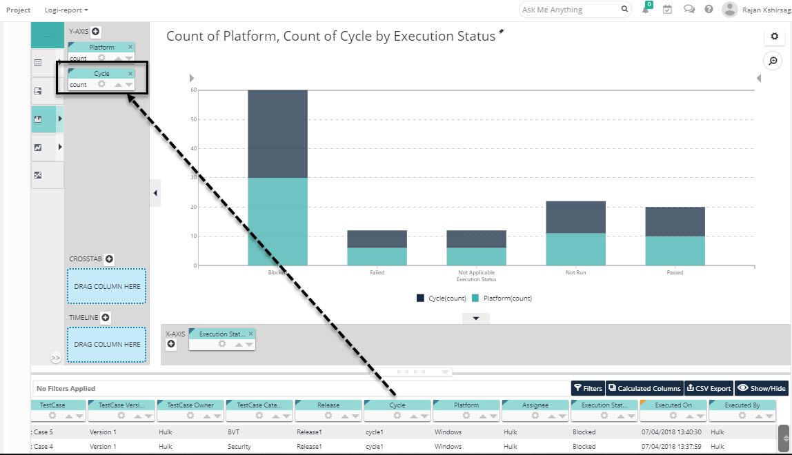
You can also drag-and-drop additional pills into an axis zone to add additional series to the chart. In the example shown above, the Cycle column pill has been dragged into our earlier chart, in the Y-axis drop zone, producing a chart with two "stacked" series.
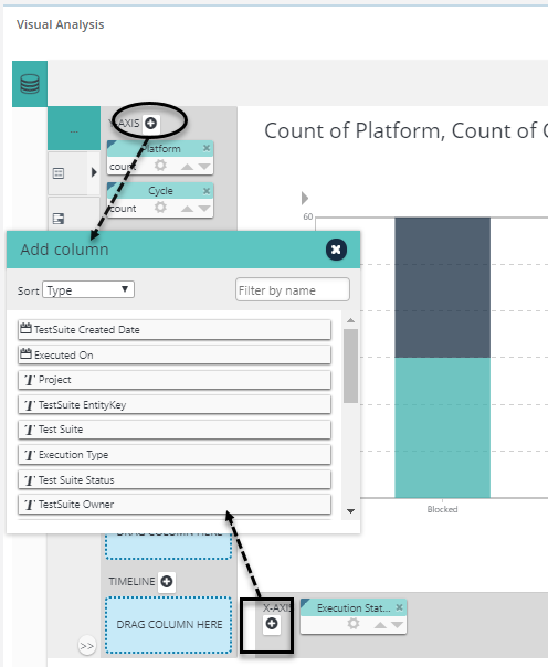
If you have difficulty dragging-and-dropping pills using the Blue Dot Connector, for instance on a mobile device, you can also add columns by clicking the "+" icon, circled above, and selecting them from the Add Column dialog box.