Visual Analysis
Overview
What is Visual Analysis?
The Visual Analysis provides you with an advanced & easy-to-use interface to quickly create your own Customized reports for category bases analysis. This generates "best-fit" charts for the report data automatically.
Why Visual Analysis?
QMetry already have pre-defined system default reports which generates the data reports with the charts & these reports are based on the business processes of organizations who usually follows. The important role of Visual Analysis comes in picture when bigger enterprise level organizations in a need of to generate the reports with graphical orientation on the basis of their realtime data with their own complex report requirements. This feature gives the strength to the users to customize the reports to bring fruitful values to their organization.
Who can use Visual Analysis?
The best part of this feature is, this is accessible for all the folks who are the users of QMetry. Individual users can create their own customized graphical reports & can add them in their gallery. These reports can be shared amongst the users you want. The report generation can be a one time activity & can use unless this get re-customized.
What ease Visual Analysis provides?
The main fundamental base of report creation is SQL queries. Most of the integrated report dashboard modules are designed considering the user of the tool must be a SQL language professional who can write their own report queries and generates the report charts. Actually here this feature overcomes this challenge for users with the least knowledge of SQL or subsequent language. Isn't this smart?
Understanding of Visual Analysis Report Chart orientation
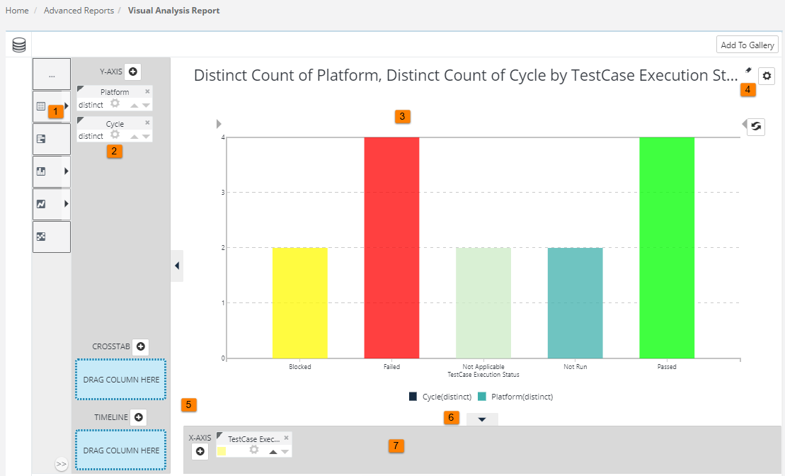
The user interface consists of two main areas, as shown above. The upper area displays the charts and tables you create and the lower area displays your data in a simple table. Here are some more details, keyed to the numbers in the image above:
- Visualization Menu - Click to select a visualization appropriate for your data and to easily switch between types.
- Pills - Column "pills" in X- and Y-axis "drop zones" identify the data columns used to create the visualization.
- Visualization - A Chart, Crosstab Table, or other visualization is displayed here when you select its data.
- Settings icons - Click to control the legend (may also have other purposes), delete the visualization, or choose selection modes.
- Extra Columns drop zones - Dropping column pills here to create a Crosstab Table or a Timeline Chart.
- Show/Hide arrows - Click to show/hide pill drop zones; allows you to see a larger view of the visualization.
- Table Resizer - Click arrows or drag dots to change the number of table rows shown.
- Data Enrichment - Click to open drop zone and controls for creating data filters, calculated columns, and do more. Once created, filters are listed in adjacent area.
- Column Pills - Pills appear at the top of each column of data in the table; they contain sorting, filtering, and other controls. Custom Fields/UDFs are now also supported in Visual Analysis Report. Hence, users can view Custom Field values for the relevant asset.
- Data Table - Data available for analysis appears in a table here. It's pre-selected by your application developer and may be restricted by security permissions assigned to you.
The Visual Analysis report feature is an investigative tool and, as such, the charts and calculations you create in it are for quick analysis of your data. Our QMetry application has been configured to do so, they can be saved and re-used in later sessions.
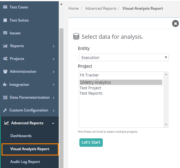
Define Report
Report generation is based on the categories. The initial step is to select the category of the data on which report has to be generated for the user. So, defining the report requirement & its falling creating is mandatory.
- Go to Advanced Reports > Visual Analysis Report.
Category List
- Execution
- Issue
- Issue-Jira
- Requirement
- Requirement-Jira
- Test Case
You can generate custom reports separately for Requirements/Issues created in QMetry and imported from Jira.
Create your First Customized report
Let's make first visualization, a bar chart, so you can see how easy it is to do. In this, and the following examples, we'll use data from the QMetry Test case execution database but you can use any data (list provided) with similar data types to follow along.
In this example, we'll create a chart that shows the Count of Platforms which has the executions done with statuses as Passed, Failed, Blocker & Not Run.
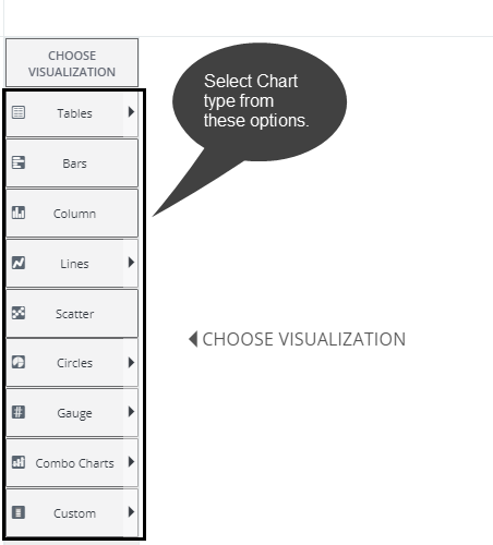
Step 1. After the Visuals loads, select the Bars chart from the visualizations menu on the left of the page, as shown below:
Step 2. Two blue "drop zones" will appear, as shown above. In the data table, click the Platforms column "pill", drag it to the Label drop zone, and drop it there. We call the line that appears when you drag a pill the "Blue Dot Connector".

Step 3. Repeat the process by dragging the Test execution status column pill into the Data drop zone, as shown above.
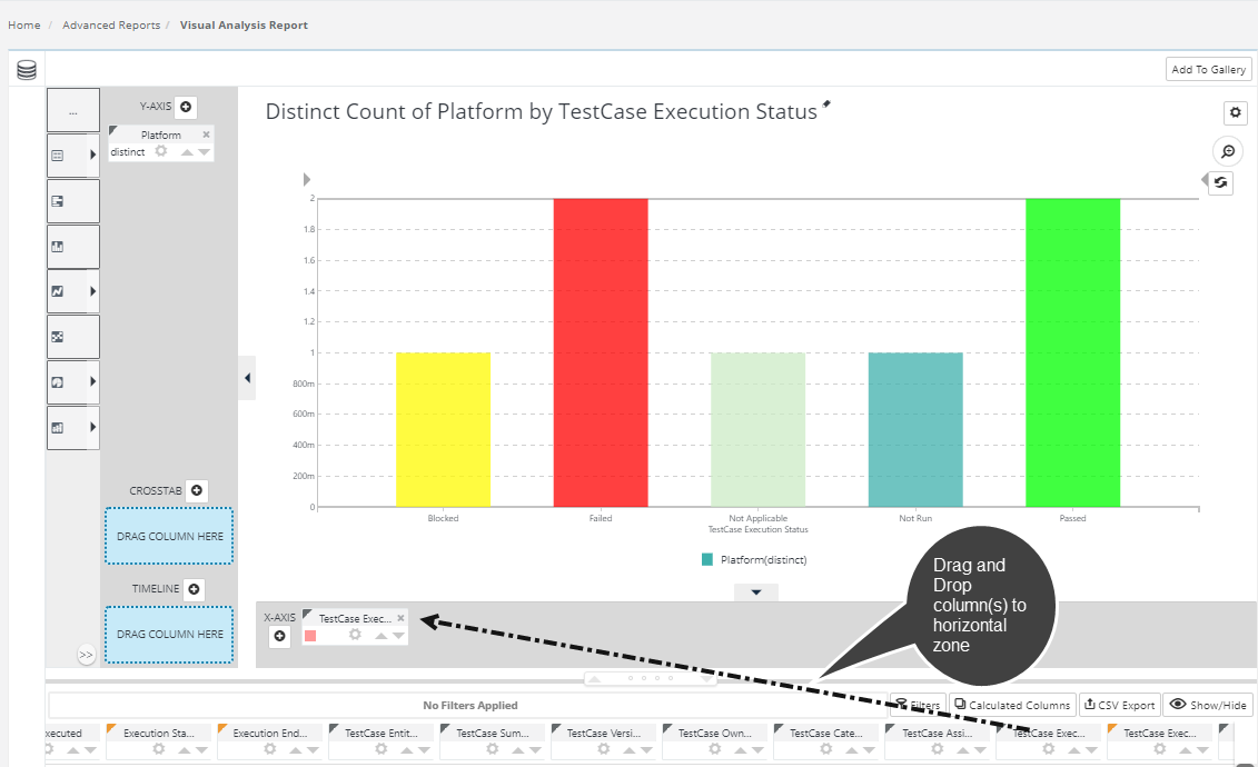
A chart will be instantly generated, as shown above. You've just learned the Visualization Analysis most important technique: dragging and dropping pills. That was easy, wasn't it?
Explore Chart
You can explore the chart using the icons provided with the chart.
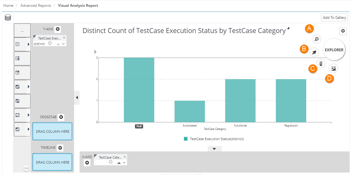
| Icon | Description | |
|---|---|---|
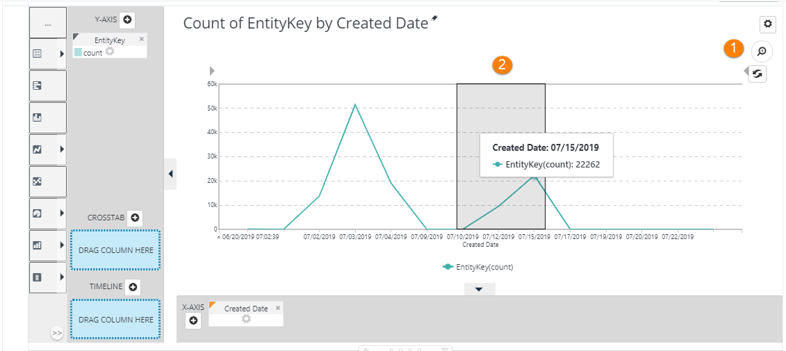
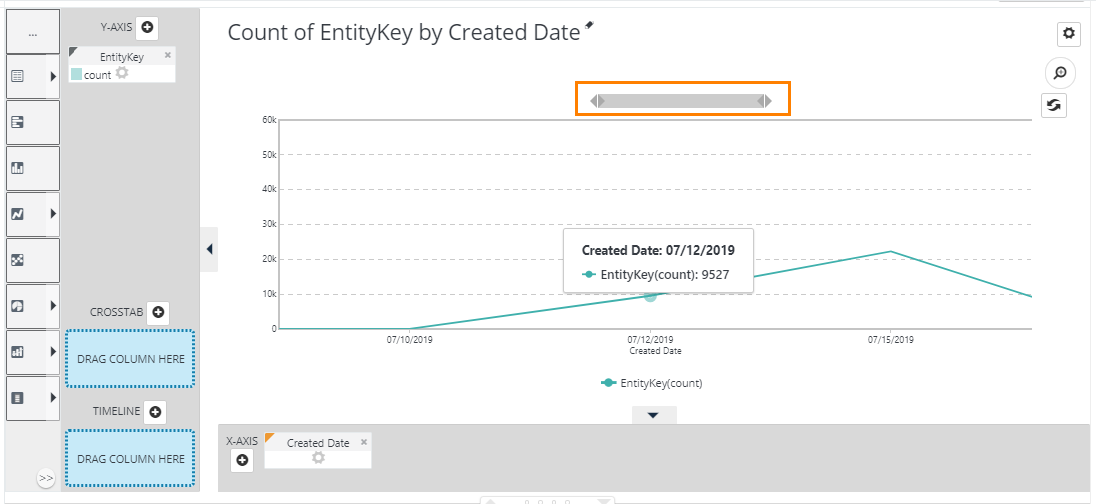
A. | The icon is used to zoom in and zoom out on the chart. For example, there is a line chart displaying test case creation count during a specific period. You can zoom in to particular days to view the test case creation count only during those days.
Click on the zoom icon and select the area on the chart that you want to focus. You can select the area through drag and drop.
You can get closer look to the area now. You can still adjust the view of chart by dragging the bar ends above the chart.
| |
B. | This icon is used to focus on a particular section of the chart. Select the icon and click on a specific bar/column to highlight it. To take out the highlight click on the bar/column again.
| |
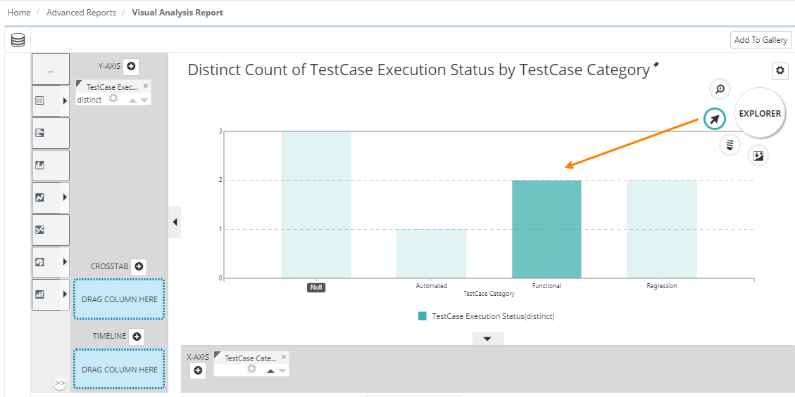
C. | This icon is used to drill down on a specific bar/column. For example, we drill down on the Functional column by selecting the icon and clicking on the Functional column.
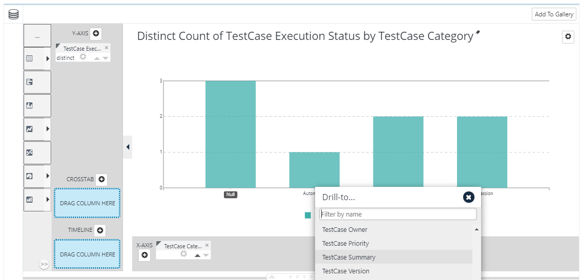
It asks you to select the field to which you want to drill down further and view the details of. We are selecting Test Case Summary here to view.
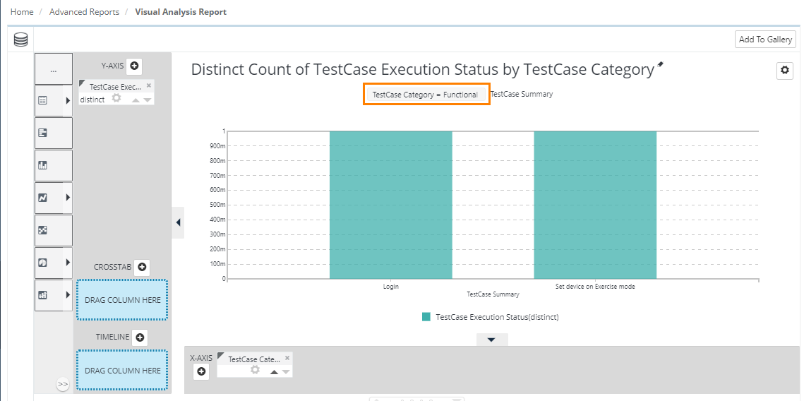
The Test Case Summary of Functional test cases is displayed. As you drill down, the chart displays the conditions applied to it outer side.
You can further drill down to other information by clicking on the bar/column of Test Case Summary. The conditions applied to outer side will keep adding above the chart. To reverse drill down or to get back to the previous chart, just click on the recent condition displayed on the chart. To get back to the original chart, just click on the very first condition displayed on the chart. | |
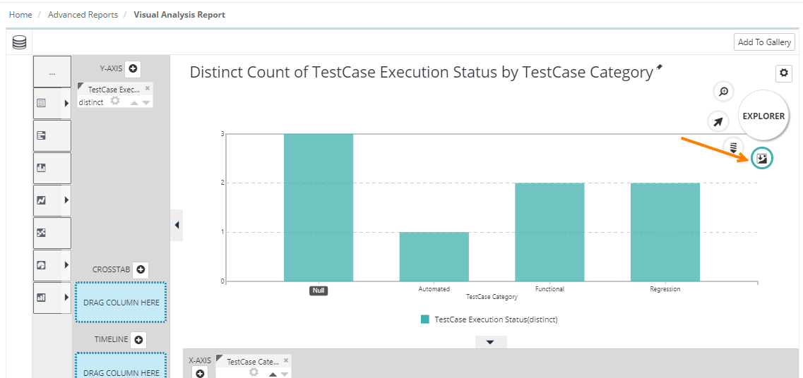
D. | The icon is used to download chart in PNG format. You can attach the chart in your email communication or share with other users as required. Click on the icon and it will download the open chart in .png format.
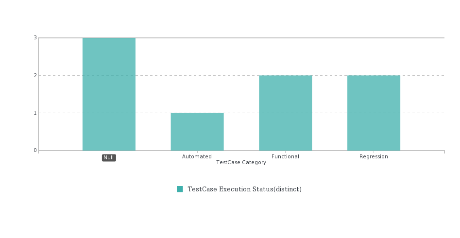
The chart is downloaded as shown here.
| |


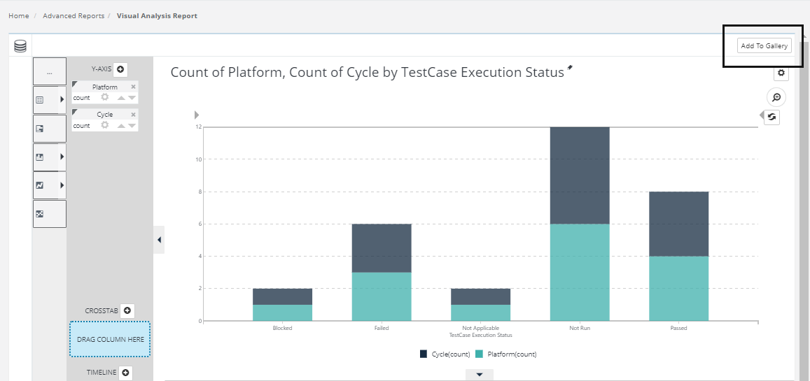
Additional Visual Analysis functionality Features
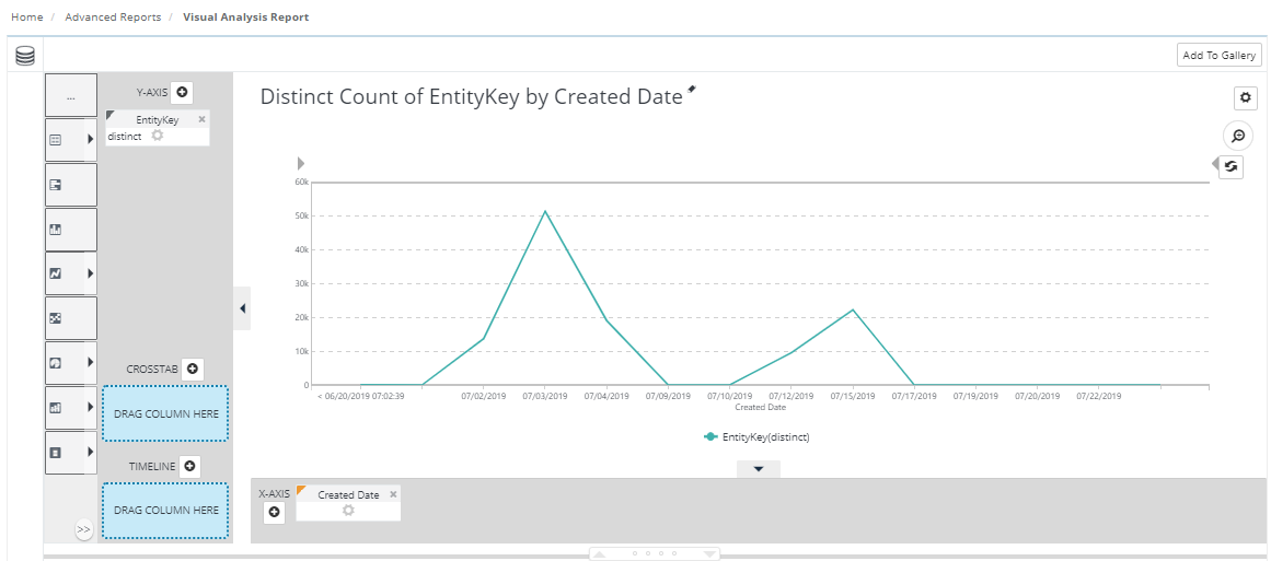
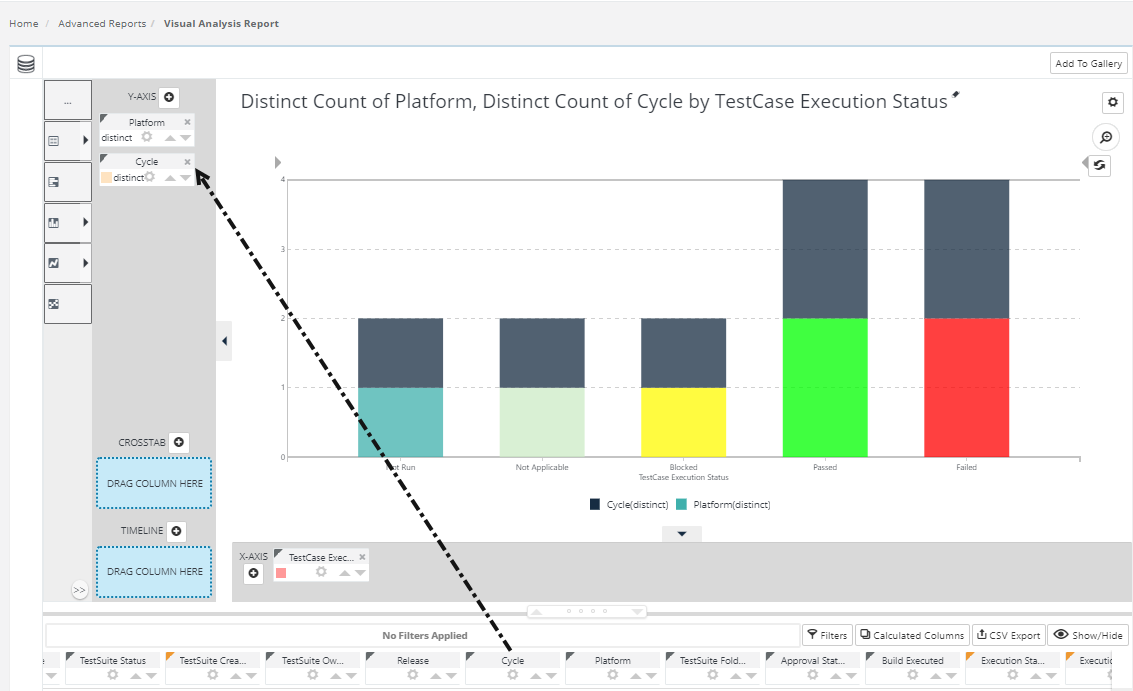
You can also drag-and-drop additional pills into an axis zone to add additional series to the chart. In the example shown above, the Cycle column pill has been dragged into our earlier chart, in the Y-axis drop zone, producing a chart with two "stacked" series.
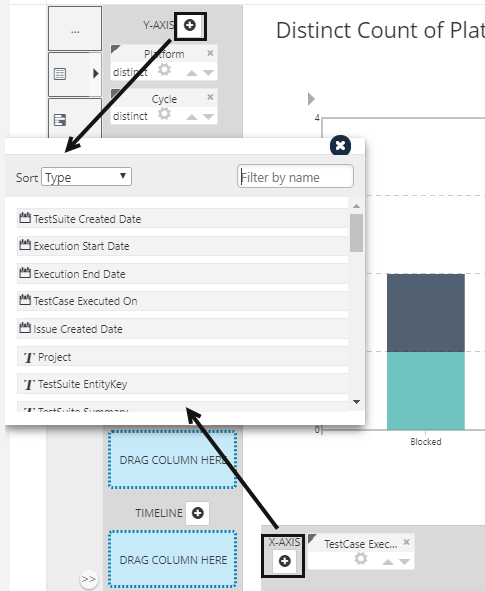
If you have difficulty dragging-and-dropping pills using the Blue Dot Connector, for instance on a mobile device, you can also add columns by clicking the "+" icon, circled above, and selecting them from the Add Column dialog box.
Adding Your Customized reports to Dashboards and Galleries
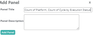
The Visual Analysis includes an optional feature that lets you create a visualization in the Thinkspace and then add it as a new panel in an existing Logi Dashboard in another report, or add it to a Visual Gallery.
It will say to : "Add to Gallery" >> Add panel.
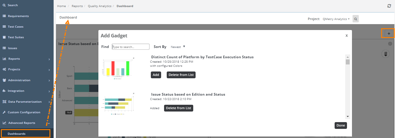
The chart added to the gallery will be displayed on the Add Gadget pop-up when you add new dashboard (by clicking on the '+' button under Advanced Reports > Dashboards).
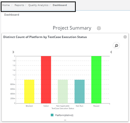
When configured for use with a Dashboard and the button is clicked, the visualization is added immediately as a new panel in the Dashboard, as shown above. Just before the visualization is saved, you'll be prompted for the Panel Title (with the chart title from the Thinkspace provided as a suggestion) and an optional description for display.
The new visualization thereafter appears in the Dashboard Configuration Page or the Visual Gallery, as shown above, just like any other resource, complete with a thumbnail image. The visualization can be removed from the visible dashboard panels and from the configuration page or gallery entirely, using the usual controls.
You can insert multiple charts into a Dashboard using this technique. For more information about Dashboards.
Editing Dashboard Reports
Users can modify the created custom reports to accommodate the changed criteria.
Use Case: QA Manager wants a way to edit filter criteria of existing custom reports without having to create a new report each time.
Go to Advanced reports > Visual Analysis Report.
Create Visual Analysis Report.
Add that report to Dashboard.
To edit the report added to the dashboard, go to Advanced Reports > Dashboard.
Click on the cog icon of the report that is to be edited and select Edit Visualization.
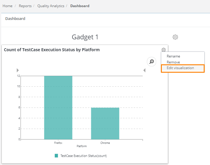
It navigates opens the graph in editable mode.
For any required changes in the existing graph, you can modify the chart directly without creating anew.
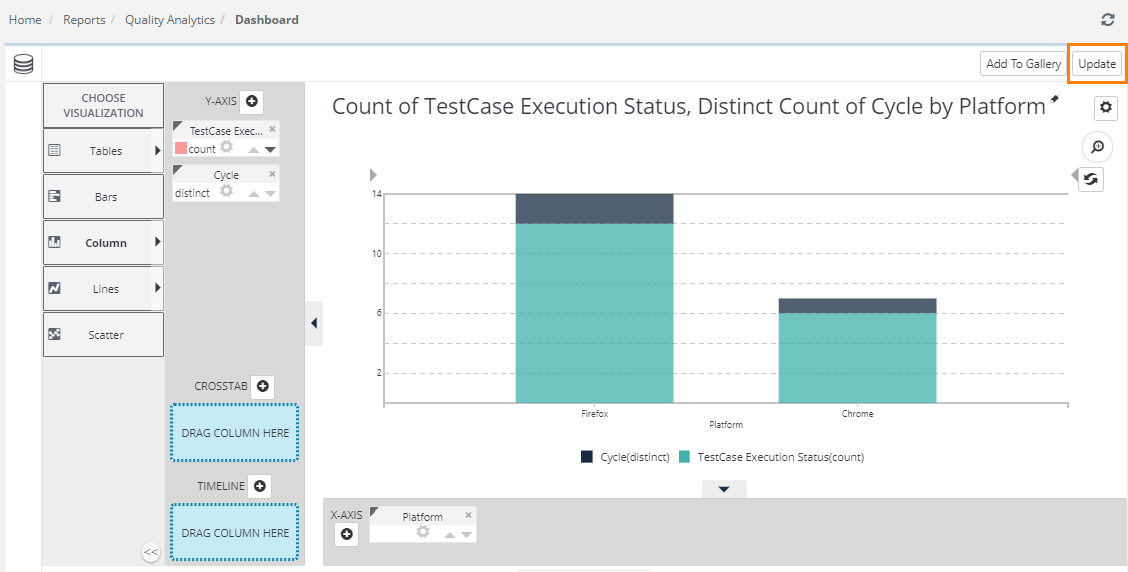
Once you are done with the changes, click on the Update button at top right corner to update the gadget with changes.
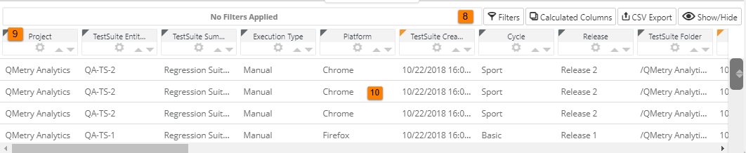
Exporting Data to CSV File
The Visual Analysis includes a feature that allows you to export the data in your table to a file in standard Comma-Separated Values (CSV) format.
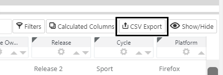
Click the CSV Export button circled in the image above to initiate an export. All columns and all rows in the table will be exported.

Your table data will be exported, as shown above, with column names in the first row.