Back to QMetry Wisdom for JIRA Product Home Page
Back to QMetry Products Help Page
Analytics
Watch Video
Table of Contents
Test Results / All Test Scenarios
The report shows test results of all test scenarios irrespective of execution of same test scenario multiple times. This execution status report displays combination of test results achieved through automation testing. It displays results in three statuses: (1) Pass, (2) Not Executed and (3) Fail.

Hovering over each pattern shows details of Status it represents, Count of test scenarios with that particular Status, and how much Percent it holds out of total executed test scenarios.
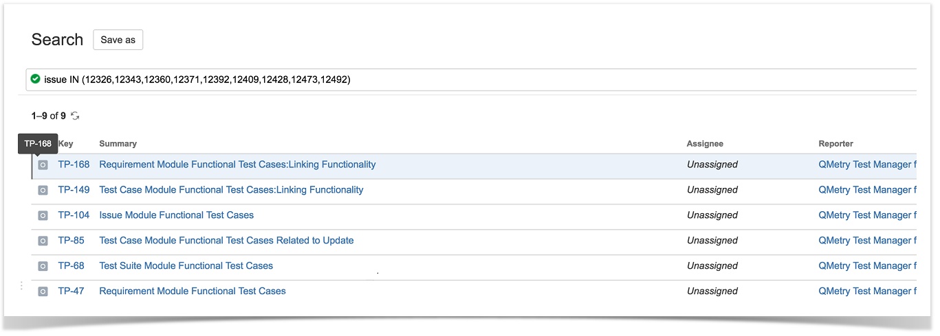
Each of the status counts is clickable; clicking on which opens the page in JIRA with relevant issues listed on it.

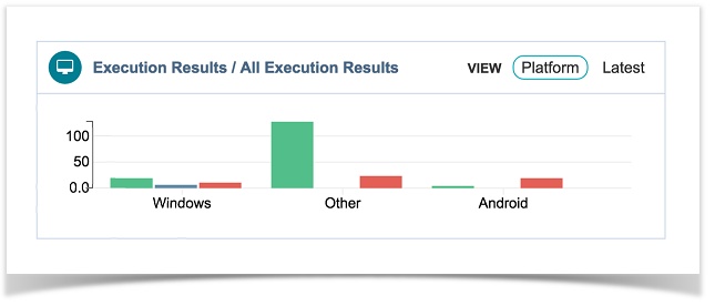
Execution Results / All Execution Results
There are two Views of this report: (1) Platform (2) Latest.
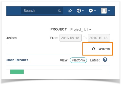
(1) Results by Platform
If you select the Platform View, the report shows test results of test scenarios grouped by Platforms on which they run against.
It is a bar chart. When hover over a bar, it displays stats that include total count and percentage of test scenarios based on the execution status. The count also includes repeated runs of same test scenarios.
The report indicates how many test scenarios executed on which Platform e.g. Google Chrome, Firefox etc. and what their results are.
On the graph, the X-axis represents Platforms and the Y-axis represents Count. On hovering mouse over a bar, it displays Status, Count and Percent details.
(2) Latest Results
If you select the Latest View, the report shows latest test results/executions of all unique test scenarios.
In case a test scenario is executed more than once, then its latest execution is considered for inclusion in the report.
The last occurrence of execution and its consequence results, Passed or Failed, are picked for report even when the test scenarios are run multiple times creating duplicate count of scenarios.
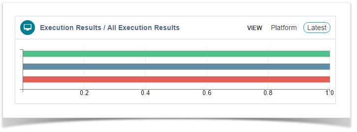
On the graph, the X-axis represents Counts and the Y-axis represents Statuses. On hovering mouse over a bar, it displays Status, Count and Percent details.
Each of the bars is clickable; clicking on which opens the page in JIRA with relevant issues listed on it.
Execution Trends
For a particular period, the line chart shows the trend of test scenario executions in terms of execution results “Pass” and “Fail”. In other words, how many test scenarios are getting passed or failed for a particular period.

Select Period from: Daily, Weekly, Monthly, Yearly.
You can select which legends, i.e. Statuses “Pass” or “Fail” or both, you want to see on the graph by selecting respective check boxes.
On the graph, the X-axis represents Period and the Y-axis represents Count. On hovering mouse over the intersection, it displays the Count and the Date the test was run on.
The cumulative count for each status is displayed at the right of the graph.
You can zoom-in and zoom-out the chart view for a particular period by just dragging the mouse pointer and selecting a particular area on the chart.
It gives you a closer look of the period you selected on the chart above.
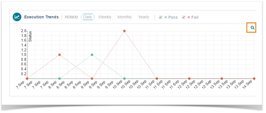
Click the icon to get back the default view of the chart.
On clicking any of the intersection points, the chart view changes to grid view.
Grid View
You can see Test Runs at left and Test Scenarios at right.

1 Status Filter.
2 Click to open the Test Run in JIRA in a new tab.
3 Click to open the Test Scenario in JIRA in a new tab.
4 Expand Test Scenario by clicking on it.
5 It displays Action Steps under it. You can see the execution time of each action step and execution time of the test scenario i.e. total execution time of all action steps.
6 Sort the Action Steps by Duration, Execution Order
7 Select the status you want to view the action steps with. Select "All" to view action steps with any of the statuses.
8 Click the  icon to open the Action Step in JIRA in a new tab.
9 Click the  icon to view Error Information (in case of error).
10 Click to view other test scenarios that get affected by the action step.
11 Click  to return to chart view.
Performance Bottleneck
This is a bar chart that displays what test scenarios are responsible for hindering performance of the test automation process.
It helps the Analyst –
- analyze the Automation test results.
- Compare actual execution time with the standard execution time and identify test scenarios taking longer than average time for execution.
- isolate the test scenarios responsible for Performance Bottleneck and pinpoint the root cause.
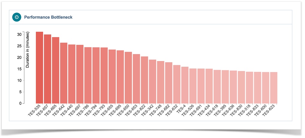
On the chart, the X-axis represents Test Scenarios and the Y-axis represents Duration (in seconds).
On clicking any of the bars, the chart view changes to grid view with that particular test scenario details.
Grid View
You can see Test Runs at left and Test Scenarios at right.

1 Sorting of test scenarios
2 Expanding a test scenario
3 Sorting of action steps
4 Filter action steps by Status: Pass, Fail, All
5 Total execution time of the test scenario
6 Execution time of the action step
Most Failed Test Scenarios
The report shows most failed Test Scenarios during their execution.

Fail Rate = Number of time the scenario got failed/Number of time the scenario executed
Fail Rate and Test Scenarios are clickable which displays –
- Test Runs the Test Scenario associated with.
- Action Steps covered under the Test Scenario.
- Test Runs and Action Steps can be opened directly in JIRA for further analysis.
Errors by Grouping
All errors remain by default under Uncategorized Errors which is system default Group. Then user can add more Groups as and when required.
Adding a New Group
Click Add Group to add a new group to categorize the errors.
After creating a Group, you can categorize errors according to the Groups.
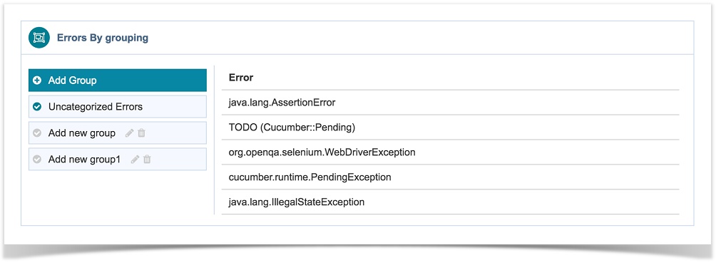
How to categorize errors?
Errors those are still uncategorized are shown under the Uncategorized Errors tab.
Just drag and drop errors to the Group you think it should belong to.
Now generate the Errors chart accordingly.
Errors Graph
The graph is generated as per the grouping done for errors above.
All errors remain by default under Uncategorized Errors which is system default Group. Then user can add more Groups as and when required.

Both the nodes - Group and Error nodes are clickable. The larger bubble indicates a Group, while the smaller bubble indicates Error within the Group.
Clicking on the Group node displays Errors by Error Group with details of –
- Error: The error that you can see on expanding the Error Information symbol of a failed Action Step.
- Affected Scenarios: Number of Scenarios that get affected due to this error. The count is clickable; clicking on which opens Test Scenarios by Error report. Each record of test scenario is clickable; clicking on which shows details of Test Runs the test scenario associated with and list of Action Steps covered under that test scenario.
- Occurrences: Number of times the error occurred.
Clicking on the Error node displays the same details as above with that particular error row highlighted on the list.
Top Errors
Click the  icon at the extreme right corner of the Errors graph to view the report of Top Errors.
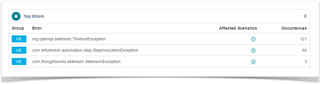
It has the following columns:
- Group: It shows initials of the Group name.
- Error: The error that you can see on expanding the Error Information symbol of a failed Action Step.
- Affected Scenarios: Number of Scenarios that get affected due to this error. The count is clickable; clicking on which opens Test Scenarios by Error report. Each record of test scenario is clickable; clicking on which shows details of Test Runs the test scenario associated with and list of Action Steps covered under that test scenario.
- Occurrences: Number of times the error occurred.
QQBot
QQBot will alert you as it makes new discoveries - bringing the power of Big Data Analytics, drill down and Actionable Intelligence at your finger tips.

Click on the robot like figure at the top and the alert panel opens at the right.

- On the alert panel, the Refresh icon on each alert section recalculates the alert content.
- Check for new Discovery: It appends the alert section for any new alerts that may arise on syncing the data.

Settings
There are two sections on the vertical panel at left: Settings and Filters.
Duration: Each test scenarios has its associated duration when the test results file is uploaded.

The default criteria for Fast, Moderate and Slow duration are:
- Fast: < 5 Seconds
- Moderate: 5 to 30 Seconds
- Slow: 30 to 600 Seconds
This default settings can now be configured by users to define the type of test scenario based on its execution time.

Filters
User can set Filters to define the criteria for generating different reports.
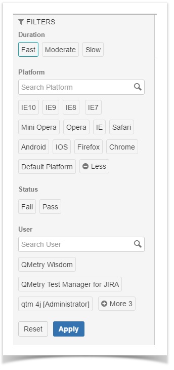
- Duration: Each test scenarios has its associated duration when the test results file is uploaded. The filter works according to the parameters set under the Settings.
- Platform: Each test scenario has its associated Platform with it when the test result file is being uploaded. If there is a platform is not associated, then it will be associated with default platform.
- Status: When the test result file is uploaded, each test scenario has either “Pass” or “Fail” results.
- Clear All: Click to clear all filters after Applying the filters.
- Reset: Click to remove filter selections.
- User: The logged-in user who generates the API key and uploads the test result file.
Platform and User picker lists: If there are more than 3 values exist on the list, then the button to expand and contract the list is provided. Also, on typing in the search box, the most relevant values will only be visible to pick from.

Sprint, Version, Label, and Component as assigned from JIRA after uploading test results.
Refresh
The Refresh button is provided to refresh the graphs on the page without reloading the entire web page.
Back to QMetry Wisdom for JIRA Product Home Page
Back to QMetry Products Help Page